[01] Update: The GUI
The GUI has gone through some changes, so here I am with the news! ^^
1. The Options Screen has changed the design of their textbuttons.
If you’ve played the current version of the game, then you know the buttons look like letters floating in the air, haha xD. The only way to see if you’ve clicked on a button (or not) is the little red square that appears next to it while the words are highlighted, indicating that you’ve selected that option.
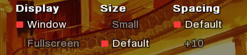
Well, I was planning on leaving it just like that because I know it’s far from perfect, but I also needed to work on more important things (like programming the actual story and my job). But then, every time I checked the Options Screen, I realized someone with eyesight problems (like me) would have trouble just looking at the screen.
It was really not that “friendly” looking to my eyes (or anyone’s). So, I decided to change it:
There was another issue with the past design: For the player to select “X” option, they needed to click on the actual letters to do it. It was a pain because sometimes you wanted to click on it but the letters didn’t highlight, so it was like AAAAAAAAHH.
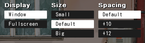
So this new version fixes this problem: You don’t have to hover on the letters to click on it; you can now click anywhere on the whole blue button. And now, you can clearly tell when one option is selected because it turns white when it is.
I hope this change is a relief for everyone’s eyes (because it definitely is for me!). Again, I know it’s far from perfect but that’s the thing! I’m not trying to make it perfect: Just decent enough for you to play it ^^.
There’s gonna be a lot of design mistakes, I know, but please, remember I’m just one person doing all the work!
ヾ(= A =;;)ノ
2. The “Mute All Music & Sound Volumen” button is different.
Following the previous update, there’s one button that differs from the rest.
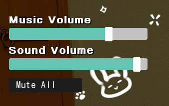
If untouched, the button itself is blue, like the others. But when you click on it, it actually turns emerald green instead of white!

Why the change here? You may think it’s because I just wanted to, lmao. But the truth is, it’s because of coherence in the design (I don’t know what else to call it tbh xD).
As you can see, this button is close to the green bars of Music & Sound Volume. And when you select the “Mute All” button, the bars become empty grey. So if I leave them like that next to a white button, it looks horrible and weird. Which is why I changed it to a color that fit!
ヽ(o^ ^o)ノ
So, that’s it for now! ^^ Until next time! ▲
Leave a comment
Log in with itch.io to leave a comment.