[02] Update: Design (again)

(Sorry for the long absence! ^^;; But I’m here again!)
Today, we’re going to talk about the “text preview”.
1. The “text preview” box
This was a feature that I wanted to add from the very beginning, but since it’s my first game, I had decided to leave it for future games because first, I’d need to learn how to implement it and, second, to design it in a way that would fit the GUI.
But the thing is, even if I wanted to, I couldn’t.
You see, because I was (still is) a newbie at creating a GUI, when I finished, I didn’t realize that I hadn’t left any space for a “text preview” box on the Preferences screen :c So, I had no other choice but to leave it like that. I promised myself that, for the next game, it’ll be more polished.
But then!
Then I decided to eliminate one- main- feature and, suddenly, there was space for it!

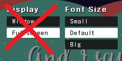
I had decided to eliminate the Fullscreen Mode.
This wasn’t a rushed or sudden decision though. I had been thinking about doing this for a while because the graphics were originally made for a Window mode (again, me is a newbie), so when you chose the FS mode, they didn’t look that great.
But! I always thought that, hey, there may be someone out there who does like playing in Fullscreen mode (just like me, who likes playing in Window mode). So I left it alone.
But after some time, I couldn’t help but to think that the graphics looked way too bad for my taste in FS mode. So, I decided to simply delete this feature, with the promise that, in future games, I would make the graphics in bigger sizes, to avoid this problem.
The thing is…
2. The Fullscreen stays!
Just to be sure, I checked my game with another computer (with a bigger screen that my laptop’s) and WOAH!! Even though the graphics looked like they were (obviously) made in a smaller scale, it DID look great!! SO great that I instantly regretted my previous decision!
So, the FS mode stayed! ^^
BUT! What happened to the “text preview” box then?

Well, I decided to keep it. But for that happen I had to move something to somewhere else because there was no space at all for more! And that’s when I realized that I could move one option to another screen…
3. The Accessibility Menu
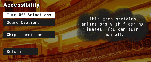
The “Animation: Turn off” option has been moved to the Accessability Menu (a separated screen) now, which fits bc this option is for people who don’t want to watch animations with bright, flashing images (like me). So now it looks like this!

Until next time! ヽ(o^ ^o)ノ
“To my dearest miracle.” -Wyne
Get And I saw the stars falling down...
And I saw the stars falling down...
Would you rather tell three ugly truths or one beautiful lie?
| Status | Released |
| Author | dmeow |
| Genre | Visual Novel, Interactive Fiction |
| Tags | 2D, Amare, Dark Fantasy, drama, Female Protagonist, First-Person, Mystery, Psychological Horror, Story Rich |
| Languages | English, Spanish; Latin America |
More posts
- A quick fix! (omg, again????)86 days ago
- A small update! 🫡Mar 28, 2025
- Re: Version 3.1 (Spanish translation & more!)Mar 26, 2025
- (Español) And I saw the stars falling down...Mar 18, 2025
- The spanish translation is now 100% done! ^^Mar 18, 2025
- THE SPANISH TRANSLATION IS FINALLY HERE!!!Mar 14, 2025
- BIG UPDATE INCOMING TOMORROW!!Mar 13, 2025
- WEB VERSION AVAILABLE NOW!!!!!Jul 31, 2024
- HOW TO UNLOCK THE SECRET ROUTE!! (Christmas gift!!)Dec 26, 2023
- Just a little update!Jul 25, 2023
Leave a comment
Log in with itch.io to leave a comment.